Let’s face it there are ample websites that followed the unusual yet weird web layouts even in 2018 that may have eroded their reputation in this digital world.
How can you tell if something is gorgeous? Of course, with the comparison as it stands in the most honest opinion from user’s perspective. With the growing trends and marketing strategies people inclined in more options and categorize the best and worst themselves. Apparently, it takes a lot to build a nice-looking web layout to make the audience stay.

A weird web design is always complexed to understand or grasp the idea of its value, moreover, it does not serve the purpose to its audience. Therefore, brands mostly hire professional web designers to have an attractive transformation.
Building a Trustworthy Website:
There are some key factors to be considerate about i: e:
- Choosing the web designer
- Do they have a professional profile?
- A layout that is easily accessible on smartphones and other devices

There are some common mistakes that every designer attempt while developing a website which may lack interest of an audience and may distort your vision from accomplishing the idea. Keep in mind that a website is basically a presentation of your business. So, take a good time for the layouts to build a trustworthy website that may glue the audience and let concept penetrate.
What is the difference between good and bad website design?
Web designs and templates keep on changing with the passage of time so as the principles, however universal rules stay the same that includes:
- Simple browsing
- Color scheming
- Attractive templates
- Animation
- Interrelation of the subject and theme
- Affiliated content
Remember that the foremost and primary impression lasts on better user experience which can structure the best usability values as well.
Apart from discussing strangely weird layouts there is a list of extraordinary and unusual templates that are taking away the major interest of audience.
Is it essential to work on a Home Page of a website?
As a designer it is important to make essential planning and laying the best web hierarchy along with the quality content. A perfect guide needs to be cascaded so that there is always something new to explore between the layouts.
A creative work can let you hop potential audience just as you planned for your business. When you have built an effective homepage, your website is projected with an amazing navigation as it exhibits the whole idea of your brand.
Website Layout 1: Feed:

This layout is excellent for displaying and demonstration as well. The exceptional concept is the gateway to understand the basics of web world. It is astoundingly combined with visual and animated components to make the user’s experience incredible. The navigation process is smoothly done and has a unique but easy to get the template.
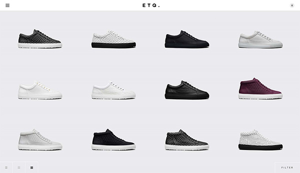
Website Layout 2: ETQ:

Another unique layout that has made the users insane through its minimal approach is ETQ which is best for e-commerce style. It is a combination of bold typeface along with muted tones so that the product is shown in flying colors over website.
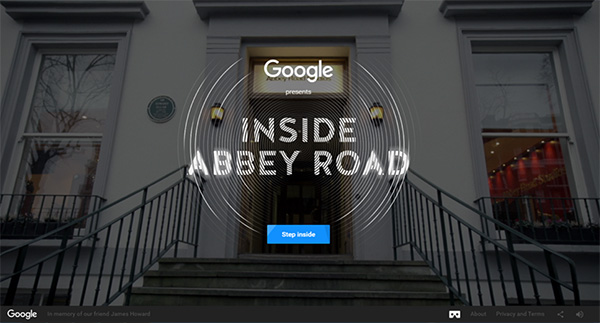
Website Layout 3: Inside Abby Road:

This template is highly Collaborative with good exploring mechanics and visual entities that has surrounded the entire template with attractive web designs. Inside Abby Road is a highly recommended template that entices every visitor’s attention.
Website Layout 4: Good Food:

If you have a food blog, then Good Food template is what you are looking for. This website layout is perfect for food, recipe and other food blog related discussions. The theme is easily navigable with unique graphics that consumes the mind energies aptly.
Website Layout 5: Motive:

This portfolio is up to minimal style and works great for personal web pages. The homepage section can be customized and can be consumed for multiple purposes along with full portfolio detail page.
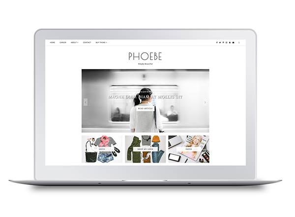
Website layout 6: Phoebe:

With multiple features this template conspires with multiple posts and lots of options that can be used for a blogging purpose. Phoebe is a template that serves with multiple structures to its promo page as well.
There are several layouts that has literally stolen the user’s attention with its epic structure which surely made an impact on their professional websites while others did not grasp the idea of new trends and have followed the weird web style for in terms of graphics, typography and color scheming. There is a ratio of individuals that complaints about the website browsing experience on their smartphone and were not satisfied with the engaging perspective as there are 90% of the mass prefer to surf via smartphone.
As per the recent survey before you start laying the foundation for a creative website think about the amount of views it gets. There are 76% who have a least interest in their first searches but would like to go back on the search engine to explore more with other options.
Does your website take more than 3 seconds to load?
People do not encourage waiting time in downloading, either it’s a web home page or an audio track. The faster navigation always leads to a successful website as people make good remarks about the brand.

There can be many flaws and good things happen to your website which is why there is always a ‘back’ button available for the users to browse another window. If your website comes with multiple links, then it is the foremost bad user experience and occurs as an ache for browsing.
Final Words:
Before hiring a web designer, you must double check their past testimonials and the portfolio of a clientele to assist you with the best creativity. You may also ask your designer for balanced text along with aesthetic web designs and build a better user experience. There are ample of trendy and fresh layouts that may change the entire idea of your website and you may induce new concepts in a manner of smooth navigation.
Author Bio:
James Brian runs a website design company. Where he provides web design development & social media marketing consultation to entrepreneur and businesses. He also covers the latest trends and industry insights by contributing his valued thoughts to industry’s several top-rated blogs.
 CoalesceIdeas Web and graphic design ideas for inspiration


