In graphic design circles, a lot of thought is given to the colours, shapes, and images used. Each colour has multiple meanings depending on where you are in the world. But it’s not only your colour choices that say a lot about your designs.
When designing for print, the typography you chose is also quite revealing. Something as simple as the font can really change the meaning of the message we’re trying to convey. Get it right, and you’ve got a winning mail shot on your hands. Get it wrong, and you could leave your business in hot water.
Typography and You – Do Fonts Matter?
90% of designers hate Comic Sans. As far as typography goes, the rounded font is best kept for products aimed at children. This blog post recreates some of the biggest logos in Comic Sans with some pretty funny results. So we all know this is one font to avoid, but what about the ones to use?
How can we pick the perfect font for our printed marketing materials? Is there such a font? Like the colour choices, each font symbioses something different. Here we look at exactly what your font choices say about you:
Serif and Sans-Serif Fonts
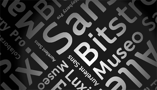
The general rule of thumb is that serif and sans-serif fonts are the safest to use. Ariel, Veranda, and Calibri are regularly used both online and in print. Stable and trustworthy, serif fonts are easy to read – wherever and whatever they’re printed on.
These fonts will tell your customers that you’re a safe choice. They almost act as a comfort blanket. Your customers use serif fonts if they’re using a word processor or writing an email. Seeing you use them too, is like seeing an old friend.
The problem is, many graphic designers see this type of typography as dull and boring. There is nothing imaginative about it. Even if you play with the kerning, leading, and tracking, it is nearly impossible to make this font something it’s not.
If you’ve got a simple, standard sales message this font family is great. If you’re going for the ‘wow’ factor, you should probably look into the more fancy fonts.
Cool and Quirky Fonts
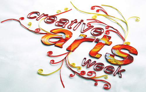
Fonts like Curlz MT, Gigi, and Script MT Bold all have one thing in common – they’re nearly impossible to read on a computer screen. When it comes to print, the story is much the same. But they have one draw over the serif family, they’re much more exciting.
With their swirls and curls, these fonts surely say something about your business. They can look elegant, they can look exciting, or they can look creative. They can look many things, but never boring. From a design point of view though, something is still missing.
Custom Typography
As a graphic designer then, surely the answer is to create your own font? Or at least adapt on an old favourite? Put a unique spin on it, change it up, and make it unique? For many businesses, custom typography proves to be the most successful type.
In printed marketing materials especially, it is challenging enough to get your messages across. There are so many obstacles – post not being delivered, mail shots not even getting opened, sales pitches getting ignored – you don’t want to make it even harder for yourself by giving the wrong impression.
Custom typography shows that you’re creative. You can make sure it says all the right things about your business, without worrying what other people might think. Like with colours, it gives you a chance to make sure your messages won’t get misinterpreted. The fonts you use say as much about you as your logo choice. Competition is fierce amongst all businesses. Don’t give someone else the upper hand by scrimping on your design choices.
Print management company, Charterprint, are the top choice is you want to make an impact with your business literature. Visit their website today to see how their services can transform your business.
 CoalesceIdeas Web and graphic design ideas for inspiration

