Mobile apps, Mobile apps everywhere not even a single app to look forward to. Seriously.. Well yes! Several Mobile app development companies launch their apps every single day and they fight for downloads and increasing their user base. What is the problem? Users certainly go gaga over apps that provides maximum utility and user experience but they have zero tolerance for low performing and obsolete tech apps.
Developing mobile application has now become a race or perhaps a ruthless competition.
In order to make sure that you do not lag behind in this race we will discuss some of the top trends of 2015 to keep you up and running in the competition.
- Big is better
 Trends in 2015 were based on the precept – “big is better”. Though people will take sometime to make this trend palatable which consist of few words over a big image or video in the first fold of the website. The navigation buttons are shrinking or do not even exits in parallax designs.Theses web design trends seems to have taken inspiration form advertisements or print media covers. The reason for the popularity of this trend is not only because of its high aesthetic value but also due to its practical implications. These pages are easy to code and also works well on devices of all sizes such as PC, smartphones, tablets etc. This happens because the layout remains unchanged irrespective of the device it is viewed on. Though this trend of full screen images came last year but this with growing the technology this trend is also evolving a lot and mobile app developers are using it widely.
 - Flat Design
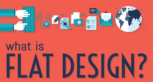
Flat designs are in mobile app development trends of 2015. Their simple structure makes the interface look cleaner. This enhances the user experience as knowing about the functionalities of the app is not a hassle in a clean interface though it becomes quite a task when the desing interface is messy. - Design to impress
The design interface of your app must be attractive enough to catch the fancy of the users is the latest trend of Mobile application development . It must also be highly relevant to the theme of your website and must convey its purpose in the first sight. The credibility of your design interface equals to zero when it fails to convey its meaning. - Layered Interface
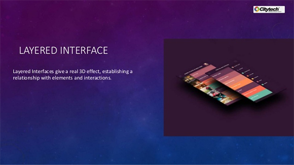
Along with implementing clean design, you also need to deploy the layered interface. This instills a 3D kind of interface for the smartphone users and also provides an incredible user interface. To implement this multilayer interface, one needs to use active widgets for the the front end and non-active for the back end. - Social Media connectivity
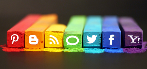
In this social networking world no one is unaware of the fact that there are millions of users active on social networking sites. Facebook, Twitter, Linkedin, Google+ and many more social networking sites present here can be integrated to your app (at least the most prominent ones) which will be a added advantage for your app. This will further work as a connector as you can incorporate any challenge or competition in your app. With social media, the users can give challenge to their friends or relatives and with whomsoever they are connected on the their social media. This will makes the passive connection of social media into an active one. - Spacing between elements and widgets
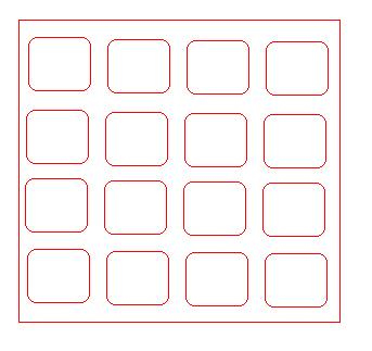
As a service provider it is incumbent on you to transmit the right message to your audience. So, you need to make sure that the content is legible and is simply posted. In order to do that do not use lines for separating elements in the content. Simply make use of spacing in order to separate the apps rather than pushing over it. - Colors affect purchasing
Colors have a very significant impact on people’s perception and it also plays a vital role in purchasing. So, it is very important that you choose your color scheme very aptly. Make sure not to choose gaudy colors which ruins all your efforts of a flat design. Choose simple and subtle colors which makes you which can optimize your design and can create a positive impact on users. - Use gestures as per the Target audience
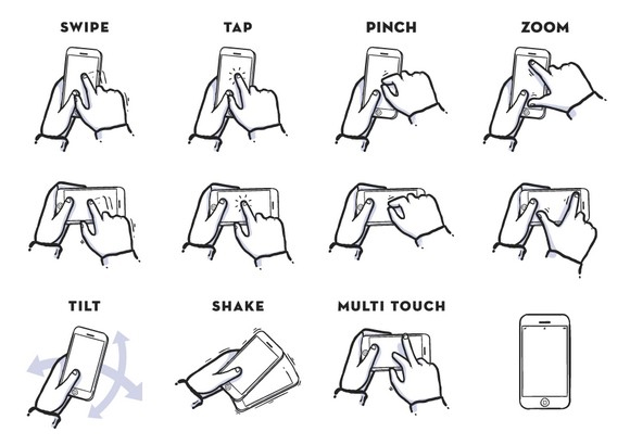
Design to cater your target audience must be your target. Connectivity with the audience is a vital feature for success. The latest trend in the applications were use of gestures. As nowadays smartphones are coming with a lot of biometric features which one can use in their app so as to make your smart app much smarter. - Focus on gestures
It might be the huge sizes of the smartphones we carry which is responsible for this trend of holding phone in one hand and using another thumb to interact. Therefore, you need to make sure that your app has the simple thumb oriented gestures as well as multiple finger gesture. Adding gestures will definitely improve the performance of your app.
- Fill & Stroke for Designing Icons
Apart from the big backgrounds or screens, Android or Iphone app development companies also focus on designing icons. A good design experience is a cumulative result of background as well as colors. Thus, nowadays they use Fill and Stroke technique for designing icons for mobile apps. This is in trend because it makes it quite easy for users to make a difference between active and inactive section which contributes a lot in providing a good user experience.
Feel free to share your opinion!
About the Author:
Amanda is currently working for Xicom Technologies Ltd- a renowned iPhone app development company. She has been an avid IT personnal with special interest in writing posts that serve as handy guide for individuals looking out to build a strong career in IT services and solutions sector.
 CoalesceIdeas Web and graphic design ideas for inspiration
