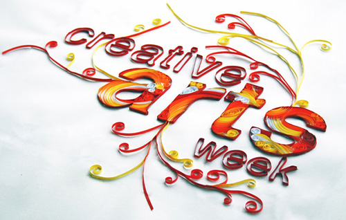
In graphic design circles, a lot of thought is given to the colours, shapes, and images used. Each colour has multiple meanings depending on where you are in the world. But it’s not only your colour choices that say a lot about your designs. When designing for print, the typography you chose is also quite revealing. Something as simple as the font can really change the meaning of the message we’re trying to convey. Get it right, and you’ve got a winning mail shot on your hands. Get it wrong, and you could leave your business in hot water.
Read More » CoalesceIdeas Web and graphic design ideas for inspiration
