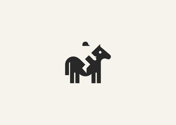
Negative Space is also called white space. These are spaces without content although they are called white space, “Negative Space” doesn’t have to be white. Negative space forms another shape out of the left space between the objects. The first shape is obvious but the second is often very difficult to see. It can be any color, it just doesn’t have any content. It is an art where it evolve in print design, logo, and web design, it is a good way to balance placement of web elements. When properly applied, the negative space effect can result in a clever and elegant shape. Good …
Read More »Tag Archives: coalesceideas
Google+ Redesigned Concept
I just love the feeling when revisiting a website specially a social networking website where we abused every day and suddenly upon the page is loaded, the question is raise whether you type the URL correctly or are you in a correct website? Social networking website that will go on overhaul design will surely receive positive and negative feedback from users, Facebook redesigning for instance, simply updating how the timeline works and how the profile page will look, we’ve witness how users react on it. We have seen in the past articles, the Samsung Galaxy S4 Website Design Concept and the Web …
Read More » CoalesceIdeas Web and graphic design ideas for inspiration

