Some small elements of graphic design remain entwined with web designing without which no web development activity can be complete. Although the contribution of graphic design may appear too small in the context of web design, it is highly essential because no web designing activity can be complete without graphic design. Graphic design contributes in visualizing the looks of the website, which help to envisage how appealing it would be to viewers. The primary communication with the audience is set up through graphic design that leads to viewer engagement. From here, web designers start building the functional aspects of the website that proves the worth of the site to the audience.

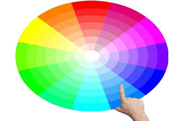
The selection of colors in website design is an essential contribution to graphic design because colors play on the psychology of the audience, attracts them to the website and keep them engaged. And not the audience alone that is influenced by colors, search engines too get attracted to it. When talking about SEO friendly websites, we usually set our sights on crawlability and indexation by search engines, which contribute to search rankings. However, you should know that how search engines interpret your website and display it depends on the selection of colors. Colors also influence searchers, and improper color selection can ruin your SEO prospects. As you read this article, you will gain more clarity about the ways color selection influences SEO.
Colors impact usability
Web designers at Tayloright construct websites in such way that during navigation users would know the items on which to click, which not to click and items that might seem good enough to click. By directing users towards clickable items, designers motivate users to accomplish the tasks that drive them towards completion of the purchasing process. To identify clickable items from the non-clickable ones, designers often rely on the technique of minesweeping.
When users move the pointer or cursor across the webpage, it comes across some items where the cursor changes its shape thereby indicating that it is an item for clicking. There is a link under the item, which would lead users to a new page. Although this is an efficient process of identifying clickable links on a page, it is a time-consuming process. A faster way of distinguishing clickable items from the non-clickable ones is to use specific colors for the clickable items consistently throughout the website.
Colors improve legibility and readability
For making the content appear attractive for reading, the web design has to support the content well for making it legible so that it becomes prominently visible that encourages viewers to go through the content. By using contrasting colors, the content becomes more legible. Black and white combination creates the most forceful contrasting effect is most widely used. Keeping the background white with the text appearing in black is an efficient way of making the text legible. Trying to place white text on a black background might appear stylish, but it affects readability for which viewers would quit the site and lower the rate of conversion.
Using texts of very small font size that is barely readable affects the credibility of the website to search engines that look at it as spam. If you are using low contrasting colors, it could also make search engines suspicious about your intentions.
Colors convey different meanings
Colors are powerful messengers and set up communication channels with viewers by conveying some meaning through association. The same color can have many different meanings. Aqua blue corresponds to a fluid state, mostly water and relates to moods like cool, tropical or whimsical. Light blue has a soft feminine touch while navy blue is bold and forthright that correlates with professionalism, dignity, trust, and security. By choosing the right color contrast for your website, you make it attractive to both searchers and search engines as it becomes more legible and easy to read the content.
Colors and culture have close links
When you are designing websites, you have to keep in mind that you are addressing the audience by cutting across geographical borders and have to handle the broader cultural issues. You must not use anything in the design that a section of the audience finds hard to accept or finds repulsive. Since colors have close links with cultures, you must consider the audience when choosing colors. The same color can convey different meanings to people of different countries belonging to the same region. The red color symbolizes creativity and life for the people of India, for the Japanese it corresponds to anger and danger while for the Chinese red is the color of happiness. You must know the audience first to decide on which color schemes to use.
How you use colors on the website determine its SEO success because from link building to conversions colors affect everything.
About the author: Maria Jones is the Head of SEO in a leading online marketing company. She has authored a few books on SEO techniques and an adviser to the SEO Company Tayloright. Maria is on the Board of Director of a Management Institute.
 CoalesceIdeas Web and graphic design ideas for inspiration


