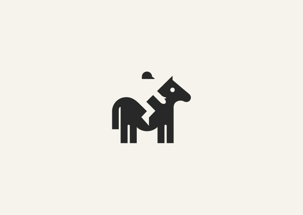
Negative Space is also called white space. These are spaces without content although they are called white space, “Negative Space” doesn’t have to be white.
Negative space forms another shape out of the left space between the objects. The first shape is obvious but the second is often very difficult to see. It can be any color, it just doesn’t have any content.
It is an art where it evolve in print design, logo, and web design, it is a good way to balance placement of web elements.
When properly applied, the negative space effect can result in a clever and elegant shape. Good designers know how to take advantage of this to create something that is memorable and captures the imagination.
Here is an animal masterpieces done in negative space by George Bokhua. Get amaze with this rendition of your favorite animals.
 CoalesceIdeas Web and graphic design ideas for inspiration


One comment
Pingback: Negative Space and 10 Clever Animal Masterpieces | Design That Sticks