I just love the feeling when revisiting a website specially a social networking website where we abused every day and suddenly upon the page is loaded, the question is raise whether you type the URL correctly or are you in a correct website?
Social networking website that will go on overhaul design will surely receive positive and negative feedback from users, Facebook redesigning for instance, simply updating how the timeline works and how the profile page will look, we’ve witness how users react on it.
We have seen in the past articles, the Samsung Galaxy S4 Website Design Concept and the Web Redesign Projects, 13 Top Websites Alternative Look – where Facebook, Twitter and Dribble website to name a few were included.
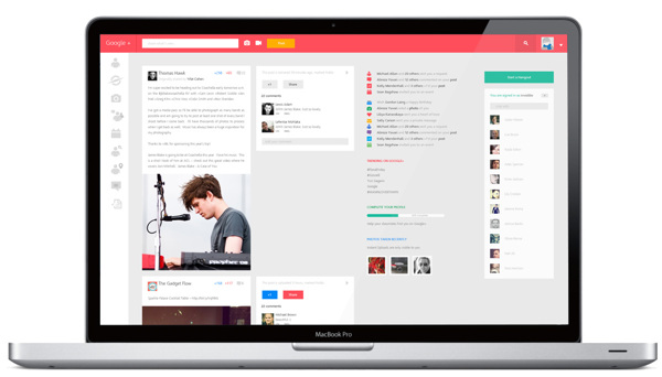
And today we came across a new redesign project from Behance, the Google + Redesign Concept by Shadman Ahmed.
A concept work (in progress) for Google +. The objective is to make it more cleaner, with lesser distraction and follow the flat UI trend in design.
Gaze on the design and share your insight in the comment area.

 CoalesceIdeas Web and graphic design ideas for inspiration


Ill dig it if it goes trough, looks useful and clean, appealing without overhauled
like windows 8
Awesome metro style design.
most likely it is a metro style inspired design