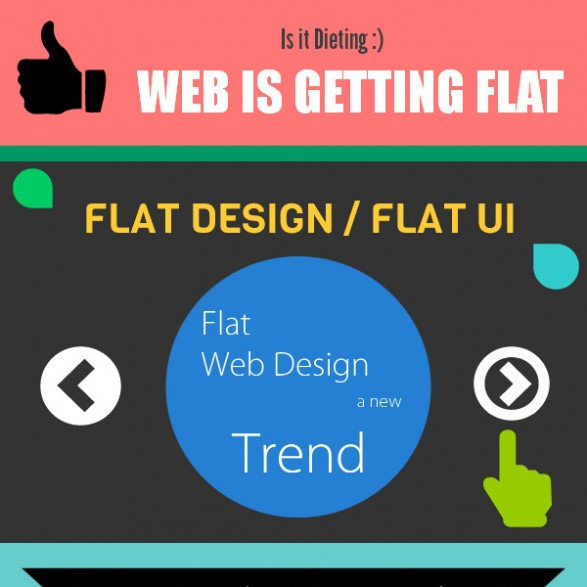
Flat web design is a rage nowadays! But why is it so popular? The reason lies in its use of simple effects to bring up a design scheme which do not belong to the category of skeuomorphism or do not have 3D attributes. In short, effects like gradients, embossing, bevels and drops shadows are completely removed from flat web design.
The appearance of flat design is simple – direct and user-friendly, thus making it a stupendously popular (as well as trendy) option for mobile user interfaces. Of course, going flat has its own set of benefits. The content is straightforward, and hence, has more clarity. There is also a minimal need for illustration, and the absence of visual effects improves the page loading time. And as an addition, the use of bold and bright colors in flat design takes it to a whole new level. Web designers all around the globe are producing different shades and contrasts from just a handful of colors. This expansion of the palette has thrown the traditional rules of color pairing out of the window, and has brought in an era which is bright and bold with lots of pop.
What Are The Popular Colors Used In Flat Design?
How will you know which are the most popular hues used in flat web design? From oranges and yellows to greens and blues – you can have a look at all of them at FlatUIColors. Not only can you view and choose a color, but can also download it free of cost. As you’ll surf through this website (or any other flat website for that matter), you’ll see that more than 90% of them have strictly gone with the primary colors, but the pure forms of the three primary colors are overlooked in favor of richer, mixed colors.
Coming next are the retro color schemes. These colors are less saturated, as the foundation is built on the bright colors but are toned down with the addition of white. As the colors are toned down and muted in intensity, it becomes more common to spot the primary and secondary colors getting used as retro color schemes.
The use of monotone colors are also quite common in flat web design. These colors are especially seen getting used for mobile app design. The monotone palette relies on a single color which is paired with white and black. There is a main base color and a couple of tints are used for additional effects. Thus, a distinct yet bright and eye-catching palette is born. Blue is the most popular monotone color, but mobile web designers also frequently opt for hues of gray using red or yellow for CTA (Call to Action) buttons. Once you start with a full color i.e. 100%, you can go for tints with 50%, 20% and 10%.
Conclusion
One other reason why flat design is a huge trend is because the color use makes it look new and fun. And there is also no strict rule you have to follow while choosing colors; you can always explore newer territories. However, just make sure that the colors you choose are in sync with your project.
Finally, i would like to share an infographic related to Flat Web Design which is describing everything about this latest design trend. Here we start:
Hello i am John Atkins and am a web designer by Profession. i am from from Santa Ana, USA.I like to share web related news and articles.Get connected with me @ Google+.
