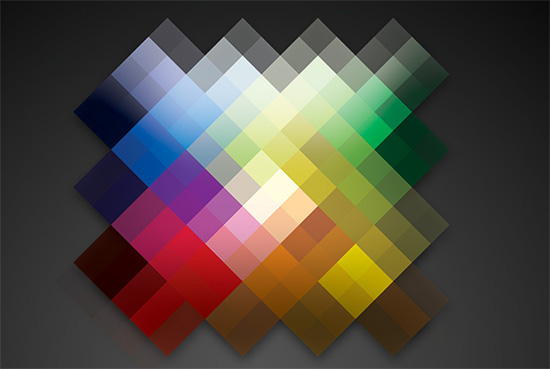
The colors to be used in your business logo must be picked very carefully. This is because colors in a corporate logo are more important than what you have ever imagined. You must remember that the logo of your company is the first object that will catch the attention of your potential and existing customers as they check your company’s marketing materials. The colors used in the logo should enhance the appearance of your product, your business website and corporate stationeries. You should make sure that the logo representing your organization is prominent, but you must also ensure that you are not using weird color-schemes to make the logo design more eye-catching. Use of such color schemes instead of attractive more people towards your business will turn them off. The tips provided below will help you to choose the right set of colors for your corporate logo:

- Ask yourself about the kind of image you want your business to have. The appearance of all your marketing materials including the business logo will depend on what kind of image you want your company to establish. The colors used in the logo of a financial institution will be different than those used in the logo of a software development firm.
- Make a list of rival companies and find out the colors used in their business logos. This step is extremely important because you should never use color schemes that have already been used by any competitor of yours. However, you must also ensure that your company logo has some similarities with the logos of your competitors. For instance, if the majority of the businesses in your sector have used subtle tones in their logos, you must avoid using bright colors in your company logo.
- We would suggest you to pick a specific element in the logo which has the potential of standing out. The element can be the name of your company or the first letter of the company name or any design element created by a graphic designer (the design element must help people to understand what your company is all about).
- The element picked by you must boast a bright, warm shade. Aggressive colors like red and black look best when used for the name of the company the logo is made for; these shades can also be used for other critical design elements in a corporate logo. You can even use shades that are less severe compared to the above mentioned ones, for instance orange or maroon, but are also bright.
- If you run a business associated with health and wellness, don’t forget to use green in the logo design. Green ensures that the logo will create a calming ambience, which is extremely important for any company offering wellness related products and services.
- If you run a business that has a female customer base, you should pick shades of purple or pink for your company logo. Such colors will make women feel that the company is aware of their needs. The majority of the companies selling cosmetics and beauty products as well as woman-only fitness centers use these shades in their company logos.
- You should avoid using yellow for the main element of your logo. This is because although bright, yellow often end up making the logo appear tacky. Yellow can however be used for accent.
Author bio: Pegasus Design House is esteemed graphic designing company widely known for its comprehensive logo design and corporate design services. The company is capable of completing all projects assigned to them within promised deadlines and with great accuracy and creativity.
 CoalesceIdeas Web and graphic design ideas for inspiration


I’ll take all that into account.
I’ll start my own business.
its great articles all information is good. colors is main part of logo