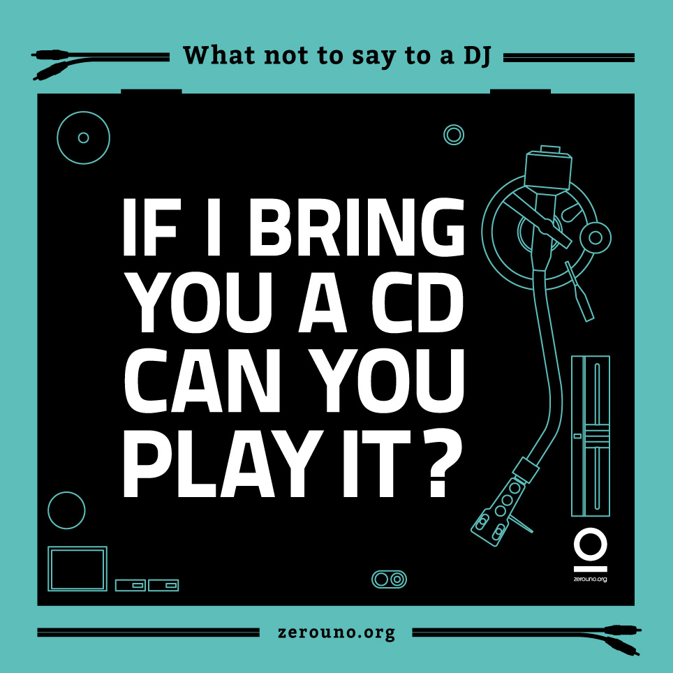
DJs are required to play musical recordings in parties or events. Roles of these professionals vary depending on the purpose or the setting of the music. They may work for radio stations where they play musical selections from playlists. Graphic designer Luca Masini of Zerouno Design created a series of graphics that feature questions or phrases that commonly annoy DJ’s. If you are in a party and get lucky to get in touch with the man who is in-charge with the playlist, try to avoid these questions unless you want to ruin the night. After the success of “What not to say to a Graphic …
Read More »Typography
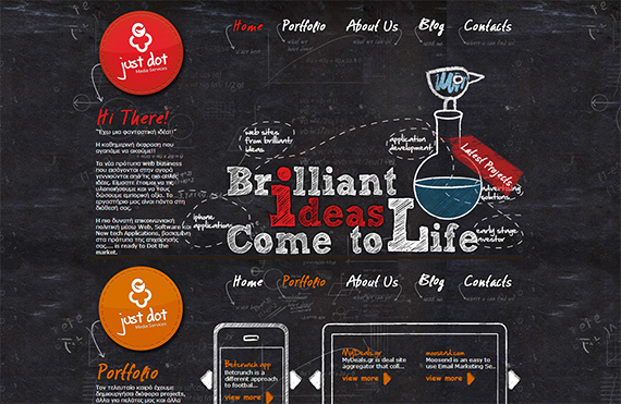
15 Slick Typography That Showcase Different Types of Businesses
We came across to one of the typography and illustration project of Jing Zhang who is from southern China, Jing is an illustrator based in East London, the epicentre of hipsters, eccentricity, and of course creativity. With her clients mostly from advertising industry, she has been working in the creative field for over 6 years, from automotive to airlines, magazines to corporations. The Sprint letters over Behance immediately caught our eyes and we have to scroll full down to view all the letterings. She is a very frequent Behance and Pinterest user, has joined dribbble in recent month. The project is Sprint’s business-to-business wholesale group has always had several vastly …
Read More »Choose The Right Font: It Is A Practical Guide To Typography On The Web
Typography is and advanced field where people devote their lives in this ancient craft. But here you can get many things to explore and learn. In this article, you can able to know about the major and important points, which you should be keeping in mind while writing. For typography, you must design the web in a way so that you can change the content according to the need. It is simply not possible to kern each title. Nowadays typography has become practical typography. In this, you cannot have total control over the kind of website. Choosing Type and Size …
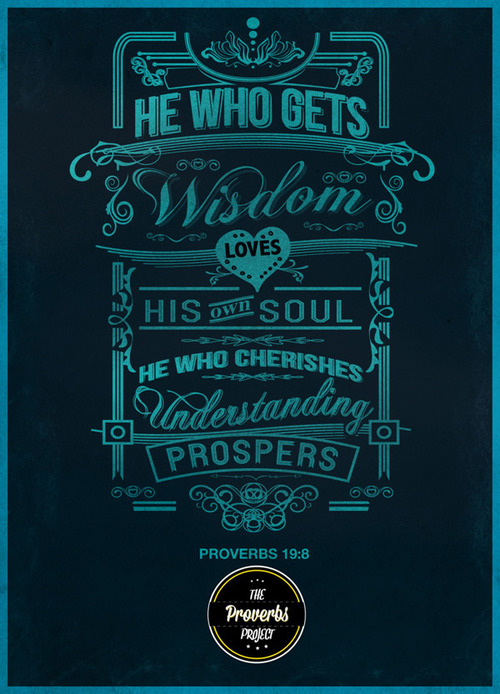
Read More »19 Astounding Typography Posters
People believed that a simple image has many meanings. It is the same on what they say, “A picture speaks a thousand words”. Well, pictures or images does really have many substances that implies different meanings to different people, because in creating or designing a certain image, it already requires words in order to form figures which will then turn out to be the picture. But, how many quotations similar to what is given will take upon if words or letters and symbols were converted into images – simply called as typography? These typographies emphasizes the creativity bound from wild …
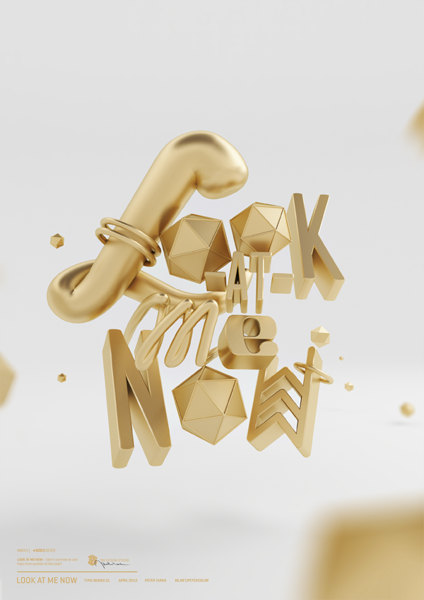
Read More »Incredible Typography Design Made by Peter Tarka
Today, we are going to show you a typography design that incredibly stands out from the rest of designs out there. The following type arrangement will surely be on top of your viewing list since they are crafted to be shiny and colorful. It was all crafted by Peter Tarka, a young graphic designer and illustrator from Poland. He has worked as an graphic designer since 2008. His works being featured in many magazines and sites about graphic design (Behance, Abduzeedo, PSDtuts and many many more). Peter sure knows how to deliver a strong creative typographic works. He has worked …
Read More »Typography in Print – What Do Your Fonts Say About You?
In graphic design circles, a lot of thought is given to the colours, shapes, and images used. Each colour has multiple meanings depending on where you are in the world. But it’s not only your colour choices that say a lot about your designs. When designing for print, the typography you chose is also quite revealing. Something as simple as the font can really change the meaning of the message we’re trying to convey. Get it right, and you’ve got a winning mail shot on your hands. Get it wrong, and you could leave your business in hot water.
Read More » CoalesceIdeas Web and graphic design ideas for inspiration
