After overcoming the heart-throbbing predictions of Mayan in 2012, last year we finally entered into 2013 safe and sound. Now, the end of this year is upon us as well, it is time we get our gears rechecked so that we can venture into the uncharted land of 2014 with zeal, preparation and confidence.
There is no denying that trends are like seasons in that old ones go and new ones take their place, yet there are some exceptions that end up making long-term spot, just like we see in web design industry. Over the decade, we have witnessed the endless evolution of this industry owing to the strikingly-amazing growth in technological developments. And, Oh Boy! You have to believe that it has really stunned not only the users but the designers and developersí community as well.
Anyway, as new technologies unveil, new doors open leading us to new tendencies and unexplored possibilities. And, we know it well that web evangelists just canít put a leash on their curiosity to explore those unknown regions. That being said, in this article Iím going to showcase the drift in web design that weíve seen so far
Unending Craze of Flat Design
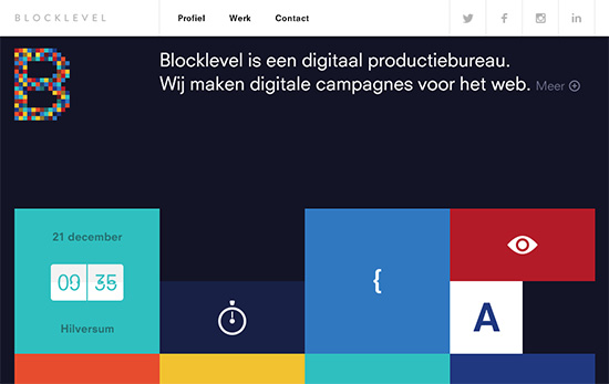
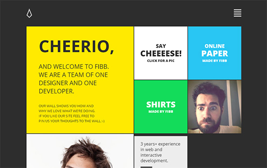
Someone said it very well that beauty lies in simplicity. For ages, we’ve though that using real-world elements or drop shadows is the only way to achieve outstanding aesthetics but with the emergence of responsive designs or portable gadgets accomplishing that goal became quite tricky until we saw minimalistic design trends making powerful waves. Believe it or not, flat designs are although simple, they look more appealing and remarkable than Skeuomorphism. These designs are content oriented with the main focus on the use of solid colors, large typos and simple interfaces.
Maximum Focus on Content

So, what drives your website? Is it the aesthetics or the content in it? Well, it is the later. Users land on your website not just to enjoy appealing visuals but to get their needs fulfilled which is only possible if youíre able to put across your message clearly yet concisely. Content focused design empowers you to present your users with something which is easily searchable, accessible and interactive on any device for enhanced user experience. Many brands hire professional writing services to get quality sales pitches and other written promotional material.
Less Text and Images but More White Space
Talking about minimalistic approach, if you look a little attentively you will notice most sites using less content in their websites while leaving a lot of white space undecorated. This idea is fairly new in the web design trends and so growing dramatically more than ever. This not only gives the user a simplistic yet engaging web surfing experience but also make it easier for them to navigate without getting lost in the clutter.
Retina Supported Layouts
Ever since the advent of responsive layouts, we see a dramatic elevation in designs that support retina display, a technology introduced by Apple Inc. Let’s face it, we want to see a website or interface with crystal-perfect aesthetics which is not possible if the design provides a pixilated viewing experience. This is where retina display comes into play. Found in Apple devices, retina display offers maximum pixel density that allows viewers to view the display without pixilation thereby giving them an immersive experience.
More and More Fixed Header Navigations
CSS3 brought it with many amazing features that have made it possible for designers to give the users an awesome surfing experience such as Fixed Headers. Header bar is an essential part of a website as it allows the users to skim through web-pages to find what they are looking for. However, with the growing popularity of infinite scrolling, getting back to the top for navigation seems more like a hassle. This is the reason why fixed headers are a necessity to make navigation easier for users.
Oversized Background Images
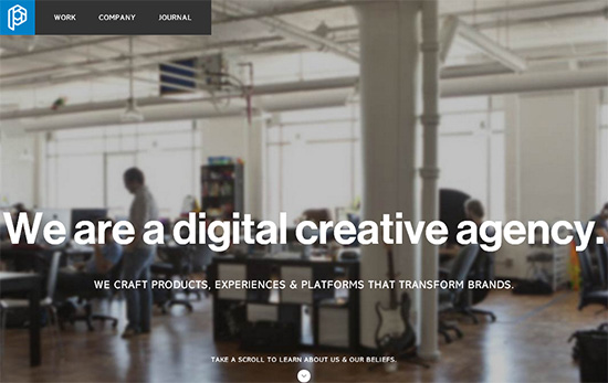
Use of large images as backgrounds is a new trend in web design first unveiled around the fall of 2012. The trend is still in fashion due to its aesthetically pleasing trait which is most suitable, especially, for those industries that offer showcases on their websites like photography, automobiles, smartphones, design portfolios, etc.
All in all, it all comes down to offering a better or more enhanced User Interface and, thus, User Experience. So, letís cross our fingers and hope to see something more spectacular in the coming year, i.e., 2014.
Saha William is a Professional Web Designer at logo divine that offers cheap logo design services.
 CoalesceIdeas Web and graphic design ideas for inspiration


