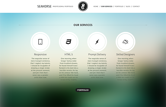
Website interaction is one measure of your ability to connect to your readers. But this does not necessarily mean that you should include tons of buttons in one page to make it appear interactive to users. On the contrary, a very “populated” website or landing page might confuse your readers. Instead of them getting interested and hooked up with your contents and being encouraged to interact with the site, they might be frustrated not knowing what to do with all the elements. In this article, we will discuss on how you could increase interaction through a minimalistic web design.

The Rise of Minimalistic Web Design
Webmasters and experts on web design have analyzed the behavior of users on the web. How much of them are staying can be counted through the analytics behind a website. When bounce rate goes higher, this indicates that users are more likely to leave the website quickly after entering it and there are low instances where they are exploring on the website.
They also found out that web design that speaks good quality is not one that is stuffed with heavy loads of graphics and bold colors. Rather, this is one that has a soul. A great website design can be minimalistic in nature whereby the design is made with personality showing interaction to the audiences.
The reason behind the hype of many web designers now abiding by this minimalism is that users tend to have more loyalty to these. As this design is targeted more on the emotional side of people, the website is created considering human experience. It has a soul that communicates directly to its viewers.
Interaction ThroughMinimalism (Shown Through Examples)
1. Effective Feedback Mechanism
Wufoois a good model where you can find a sense of personality in creating and projecting web forms. Instead of the typical “Next” buttons, it uses “Makes sense” and “Got it” to confirm the understanding of users. This language makes the users confirm deep down that the page or the agreement is clear to them before proceeding to the next page of the form.
2. Sense of Personality
Twitter is one of the most popular social media out there. Notice that its concept is very simple. With only the text area where you type your tweet limited to 160 characters and a button to publish it, you are good to go. It only has one page where all the real-time updated tweets are displayed and separate pages to view your own profile, all mentions for you and the trending topics in various specific locations. This minimalistic design gives Twitter the benefit of making the users feel confident in using the application. Everything makes sense with the limited user interface elements and each one is designed for function. To add the touch of personality to its brand, Twitter incorporates the bird, its official mascot, as the “tweeter.”
3. Error Notification
Even the error notification must be designed empathetically. Instead of displaying a regular 404 page explaining all technicalities of possible reasons why the error occurred, it is much better if you can have a call to action that gets in the way of users. For instance, MailChimp designed its 404 Page to get user feedback in an encouraging way. It tells users that “This is your moment of glory” to have them send inputs that the team may learn from to improve their service.
4. Immediate Responses
Path is a mobile application getting attention in the past months. It’s like Twitter with a different interface. One thing that’s notable in Path is that it makes use of thoughtful interaction during account creation to show its “personality.” When the user enters his password for the first time during account creation, the app will say “Looks good!” when it meets the requirement for the password pattern. This sign-up experience makes users feel more like they are communicating with a human on the other end.
5. Gaming
Every one of us has been through childhood and being children once in our lives, we have been addicted or somewhat pleased when playing games. This is just what the High-rise app made use of. The same concept can be used in designing websites. While waiting for the real content to load, users sometimes may be tired and close the window of your site. To keep them busy, you can have small games to entertain them. High-rise designed the loading page with Tic Tac Toe that can be played versus the computer.
Conclusion
Minimalistic design does not mean having a blank page only to offer website viewers, or a monochromatic theme where only a few buttons are present to invite interaction. What this means is having few and simple elements that make big experiences for the users. These are creatively designed elements in a page encouraging users to respond and have emotional connection with the website.
Author Bio:
Celina Conner is an advanced Yoga practitioner, she finished her Diploma in Business Administration in Martin College Australia as a Cum Laude. She’s also a caring mother to her one and only daughter, Krizia. Celina loves experimenting in the kitchen and preparing unique vegetarian recipes.
 CoalesceIdeas Web and graphic design ideas for inspiration


One comment
Pingback: aforeverrecovery.com