As consumers access the web from a more varied array of devices – desktops and laptops of all screen sizes, smart phones, tablets, and gaming devices – it has become more and more important to create websites that are responsive and will either appear the same across all devices or will provide the same quality experience. The key to that is scalability.
So-called “flat design” is the perfect option for responsive and scalable design. Flat design strips away a lot of the bells and whistles that are found in traditional web design, such as textured backgrounds, drop shadows, and other dimensional elements. Instead, flat design focuses on color, type and simple images.
Though flat design may sound a bit spare or uninteresting, it can actually be used to create some gorgeous websites. Here are just 5 amazing examples of HTML 5 flat design themes:
Future Insights Live
It’s no surprise that a conference on web technology has a gorgeous website made with the most up-to-date technology. This design features a Windows 8 style layout, with square blocks creating informational units that act like a menu. The color scheme is subtle and inviting.
TV Safety
Here’s a site that proves that a flat design doesn’t have to mean a boring design. The landing page makes great use of a full page graphic that ties in the menu and other navigational elements nicely. The graphic is simple enough to scale, yet interesting enough to draw in viewers.
Startup Giraffe
Color blocking is used to make a bold statement in this web design. The page scrolls with the body of the giraffe, revealing much more information about the company and many more options to explore the page. The vertical design makes the page easy to scale for smaller mobile devices, and the bold use of color and geometric design make it compelling enough to draw in casual visitors.
Rock Werchter
Flat design helps to create order from this busy page about a rock festival. Pictures, event details, and information about ordering tickets is all easily organized thanks to the simple geometric ordering. Even on mobile devices, this site would be easily navigable.
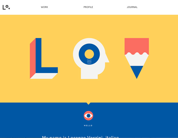
Lorenzo Verizini
This website proves that less is often more. The simple design strips the site down to its essence, highlighting the quirky style of the artist. Attention quickly goes to the navigational links, which share more about the artist and his work. The images are interesting, yet easily scalable.
There are many more great example of HTML5 flat design, and we’re sure that we’re going to see a lot more innovative as the technology becomes more in demand.
What amazing examples of HTML 5 flat design have you seen? Share your best finds in the comments!
Chloe Trogden is a seasoned financial writer and a major contributor at http://www.collegegrant.net. Her leisure activities include camping, swimming and playing her guitar.
