There are various portfolio designs available on the internet. As we know the internet is full of various design portfolios and websites. In that situation, it is very hard to stand unique in the market and grab the attention of the visitors.
It may be challenging for you and your business. So it is significant to make your online portfolio very attractive.
In this article, you can find the 20 most outstanding portfolio websites for your business and for an idea of individual designers. So let’s take a look at most inspiring websites designs.
1) FreshBooks
Why It’s Brilliant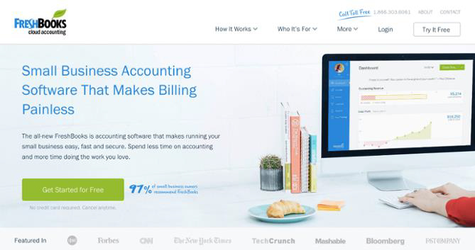
- This website is reflect the great use of contrast and positioning with the primary calls-to-action, which help reader to understand what the company wants you to convert on when you arrive.
- The calls-to-action option “Get Started for Free” is very convincing.FreshBooks explain the customers a reason why they use that product in a website as we see heading “Join over 10 million small business owners using FreshBooks.” Which is also very attractive because 10 million is a big number to pursue target audience to try this tool.
2) Airbnb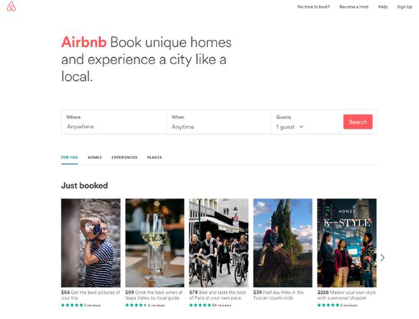
Why It’s Brilliant
- This website is also a great example of inspiration it contains a destination and date search option that many visitors want, right up front, guiding visitors to the logical next step.
- The search option is “smart,” it automatically fills the user’s last search if the user previously logged in.
- Also, a search option is uniquely stand out with the background.
- The website is showing their most popular visited place to help the customer to take a decision. It give suggestion for new tours so that their customer book trip through their website
3) Mint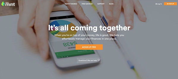
Why It’s Brilliant
- This is an example of a super simple design, and no extra headline and sub-headline.
- The homepage gives off a secure but easy-going vibe, which is important for a product that handles financial information.
- A call-to-action option “Sign up free” is the compelling thing itself. It has a safe and secure lock icon on the homepage for safety purpose.
Why It’s Brilliant
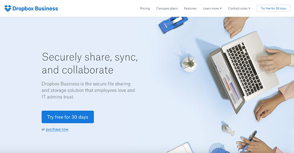
- A Dropbox itself carry a simplicity and appealing design and branding. A call to action option is very attractive “try free for 30 days”
- Its sub-headline is simple but powerful: “it has a safe file sharing solution that builds trust in the heart of people.
Why It’s Brilliant
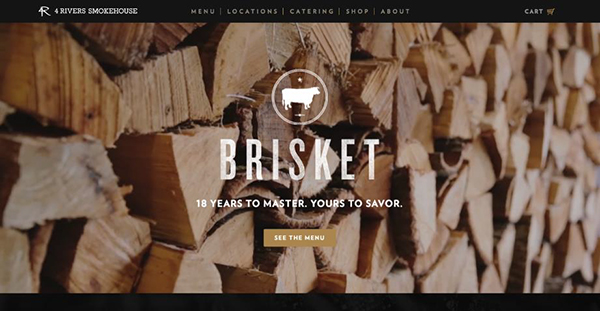
- 4 rivers smokehouse is a great website that explains the great art of photography, the headline “Brisket. 18 years to master. Yours to savor.” Is feeling like a great worth of experience.
- It provides a great scrolling guide and gives a people a great experience. This becomes a great popular design trend nowadays.
6) Cobb Pediatric Therapy Services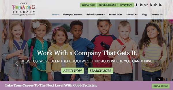
Why It’s Brilliant
- The headline and sub-headline are very attractive to the visitors: “you will find jobs where you can flourish.” This is a unique and persuasive.
- People do not find in the above screenshot but the headline is rotating ride that supplies to exact personas, from job candidates to people searching.
7) Jill Konrath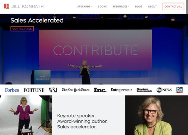
Why It’s Brilliant
- It is very simple and straightforward website. From headline to the sub-headline, it clearly depicts what Jill Konrath does and how Jill helpful for your business.
- It has two primary calls-to-action. With this, you can easily subscribe to the newsletter and get in touch.
- This website contains a news outlet logos and references as social proof.
8) Evernote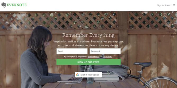
Why It’s Brilliant
- Evernote is an example of simple note-saving app which is convert into a suite of business products. It would be difficult in homepage but Evernote does a nice job which explain a various messages into few main benefits.
- The homepage of Evergreen website uses a combination of rich, soft colors in the video and its signature is bright green with white highlights so that it is easily readable.
Why It’s Brilliant
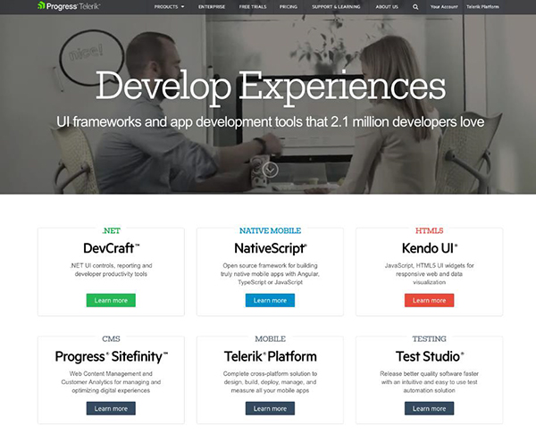
- Company that provide many technology products, in bold colors, entertaining designs, along with videography this website is a great example to make visitors feel welcome and letting them know they aretrade with real people.
- I love this simple design and its topproduct overview style is amazing. This website clearly explain what the company do and what people want.
- The font is easy to read.
10) eWedding
Why It’s Brilliant
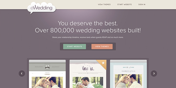
- This is a unique website that create a custom wedding website for the love birds who planning their big day. The homepage do not overloaded with image and too much headings.
- The sub-headline “Over 800,000 wedding websites built!” is great social proof to grab the reader attention.
11) Basecamp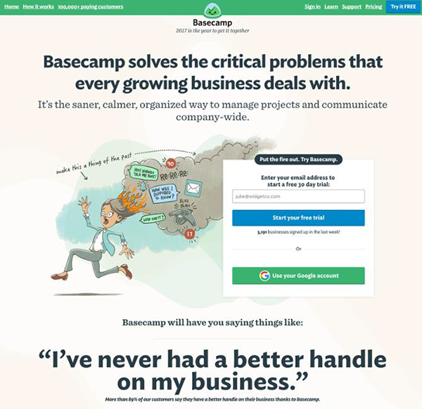
Why It’s Brilliant
- Basecamp is famous for their excellent images and headlines.
- The call-to-action is bold and easy to read.
12) charity: water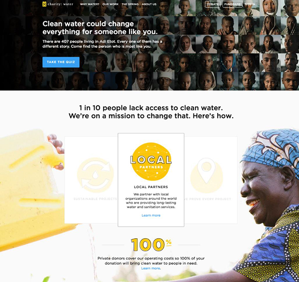
Why It’s Brilliant
- Lots of visuals, creative thinking, and interactive make your web design stand out.
- Just check the main heading which is very persuasive and attention-grabbing. The animated picture is also important.
- It intelligently uses video and photography, to capture the emotion.
12) TechValidate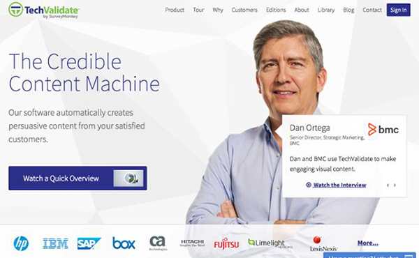
Why It’s Brilliant
- This website is a great example of utilized white space along with the font color and customer-centric design.
- The main headline is very clear and persuasive.
13) Chipotle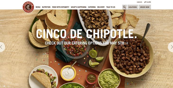
Why It’s Brilliant
- This website is a great example of alertness and continuous changes. The current homepage of Chipotle’s is all about the upcoming holiday.
- The photography of food is very detailed and beautiful, and it actually feels everyone hungry when people visited their websites. Hence they effectively use visuals.
14) Medium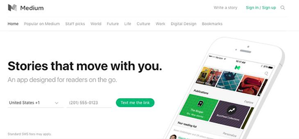
Why It’s Brilliant
- This website is one of the best examples that uses whitespace very efficiently. It darker option are eye grabbing
- When any user signs up they send a text message to their mobile phones. They use this strategy to make people engage in the signup process.
15) Digiday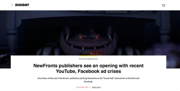
Why It’s Brilliant
- As other news publications, websites are filled with many headlines and images, Digiday’s have just one article. The heading is very eye-catching, and the visitor know what things appear when they clicked on heading
16) KIND Snacks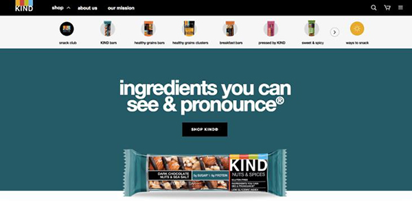
Why It’s Brilliant
- The bold colors produce contrast, making the words and images stand out on the page.
- A combination of bold color along with the black background make your website standout.
- Their KIND Snacks’ tagline is quite straightforward and brilliant.
17) Ahrefs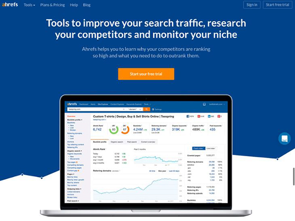
Why It’s Brilliant
- The color selection of Ahrefs are very catching that are blue, white, and orange colors.
- The sub-headline is very convincing for the entrepreneurs: To be able to start tracking and outranking competitors for free is a great offer.
18) A24 Films
Why It’s Brilliant
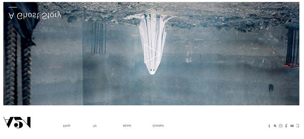
- Usually, the film company’s website contains only trailers for its new films. A24 films know video content is setup audiences want to see more and this is a great strategy to showcase A24’s work in a highly engaging way.
- At the top of the website of A24 offers countless ways to get in touch with social media and email.
19) Ellevest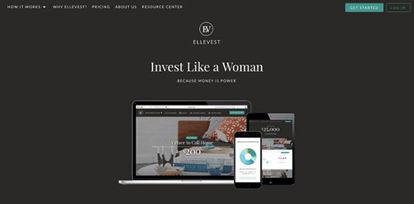
Why It’s Brilliant
- This heading “Invest Like a Woman: Because money is power.” is more convincing for both as women and a person who smart financial choices
20) HubSpot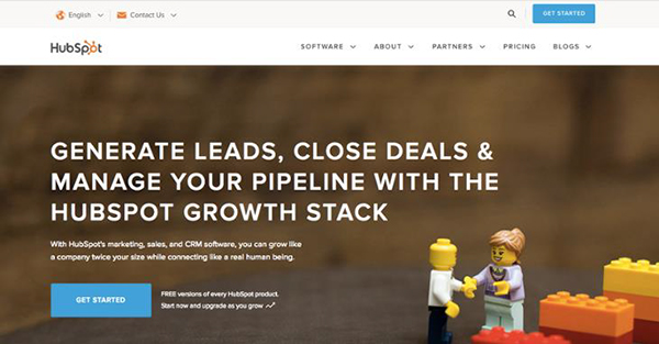
Why It’s Brilliant (If We Do Say So Ourselves)
- The characters are catching your attention because they look cute, after that they smartly showtheir messaging in the headline and sub-headline.
- Great combination of themes.
Author Bio
Kristina Gordon is a content manager and entrepreneur a reputable firm. She helps people create successful Assignment writing service for all university level of students. She is writing many marketing blog posts, where students may find helpful Knowledge on education and college life.
 CoalesceIdeas Web and graphic design ideas for inspiration
