There are some truly complex WordPress themes out there these days. While they have their charm, there is just something about the clean lines and simple tones of a minimalist design. Luckily, there are plenty of those out there, as well.
If you are one of the many fans of minimalism in web design, here are ten free WordPress themes for you to try.
1. Feijoa
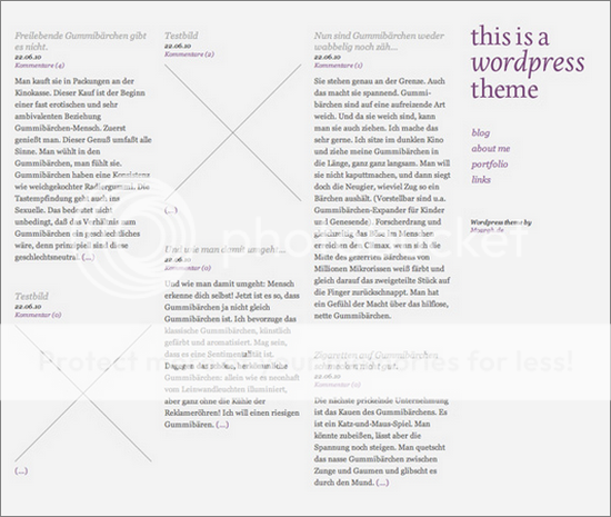
Despite being very minimalist in its overall design, this one is perhaps a little more interesting than others. It puts everything into groups on the same page that doesn’t use the traditional grid system you may be used to. However, the columns are still perfectly sized and uncluttered.
2. P2
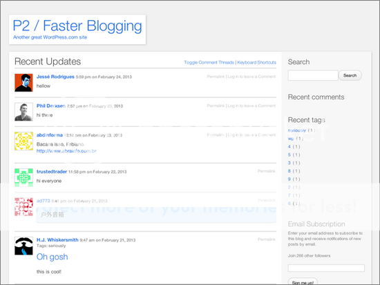
Very basic in look, this theme still packs in some real features. In-line comments and inline editing of those comments, a posting form on the homepage, real time updates, custom background and colors and a lot more are included.
3. Spun
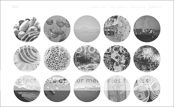
This responsive theme is excellent for portfolios or other visual content specific sites. It features thumbnails shown on the front page, each one its own small circle. The navigation fades to each page, from black and white to the color of your content.
4. Less
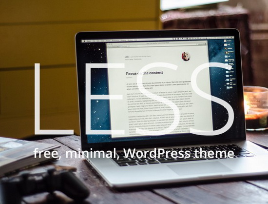
Single column layouts are becoming more rare, though they are not unheard of. This one sets out to still bring attention back to your content by using large, black text. Images remain at full width, taking advantage of the open space, and it has custom header menus.
5. Appliance
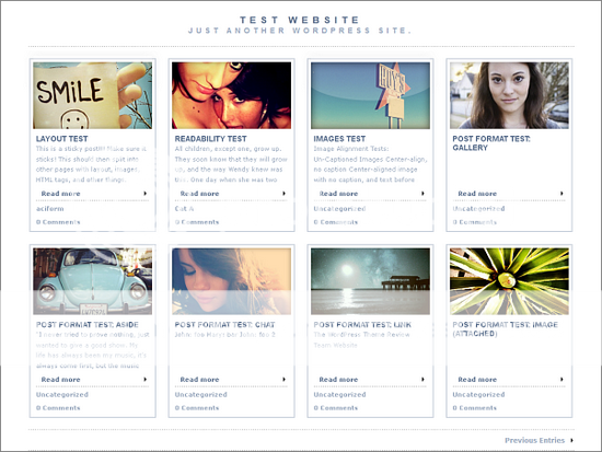
More for portfolios or magazine style blogs, this one presents each post as its own box with an image, headline, text and a cut that allows the reader to click for more. It also shows how many comments have been posted on each story. The major benefit here is that the light design makes it fast to load despite being mostly based around images.
6. Polos
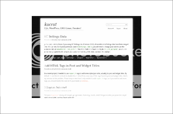
Black and white and broken up by solid line headers, this is another single column layout. But it is only built for modern browsers that use HTML5, which means the latest updates. This might have been a hindrance a year ago, but at this point the coding format has become so common that it shouldn’t present a problem.
7. Krakatau
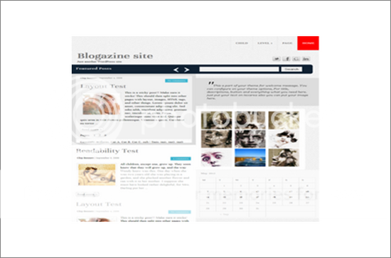
Another responsive layout using HTML5, this one is built using seven different widgets that create customizable sections. You will also have the header image, background and custom menu. The layout itself is made to support greater SEO optomization. As for the look, there is a single column. But the site is broken down the middle, all content on one side, the other side blank.
8. Sundance
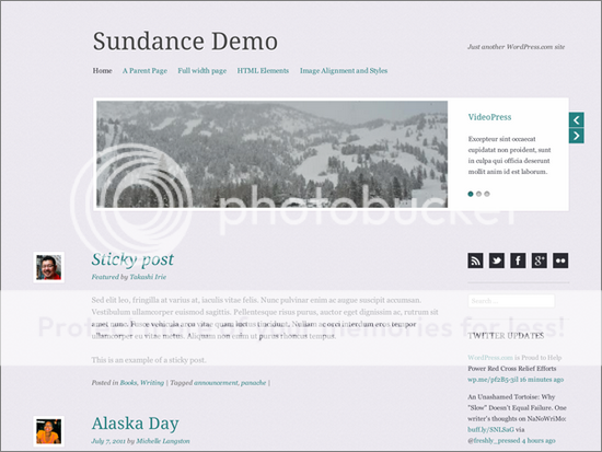
Relying on its typography to give it an elegant look, this theme is very clean and uses gray tones rather than stark black and white. The homepage has a video carousel, making it great if you post a lot of clips to your site, whether they are directly uploaded and hosted on your blog, or embedded from a third party site like Youtube or Vimeo.
9. Coffee Time
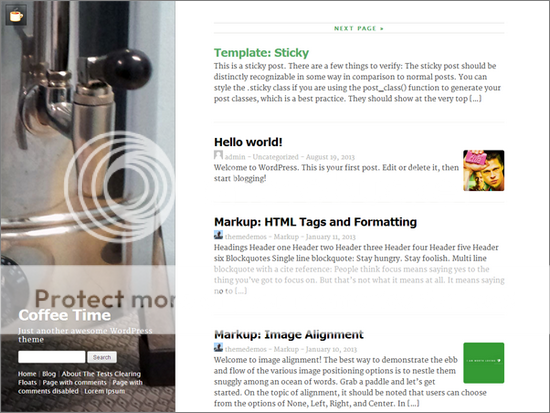
Looking for a softer minimalist design that is a bit more rounded than the straight lines of other themes? This one should fit the bill, giving you a more gentle version of the same concept. It is aimed at blogs that have collaborative (and so very frequent) content, or else longer articles without cuts.
10. Baris
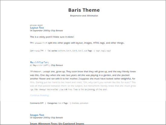
It doesn’t get much simpler than this. Responsive and built on CSS3 and HTML5, there isn’t much to say about it, which is a good thing. It is black on white, all down the center of the page, with no frills. You will be able to focus everything on your content, no matter what it is. But this is a much better theme for those who are primarily text bloggers.
Check out these articles for even more beautified look:
- What is WordPress?
- 5 Must-Have WordPress Plugins for Perfectly Optimized Images
- WordPress vs. Blogger: Which is Best?
Do you have a theme you think should be on this list? Post it in the comments below.
By Jessy Troy
Jessy Troy is the creativity blogger and social media writer living in WordPress for 5 years now. She loves minimalism!
 CoalesceIdeas Web and graphic design ideas for inspiration
