Developing websites keeping in mind the varied browsing habits has forced developers to change their tactics too. No longer is it sufficient to develop an interactive, Web 2.0 website. Today a website needs to run efficiently in all browsers and devices. Since more and more people are using their smartphones and tablets to browse through websites, it has become important to design website keeping in mind the various screen sizes, resolutions etc. For a developer who is migrating to mobile web designing and development, there is help readily available in the form of mobile web design tools and resources. To enable mobile designers to easily make mobile websites, let us look at the 10 popular tools currently making waves in the market:
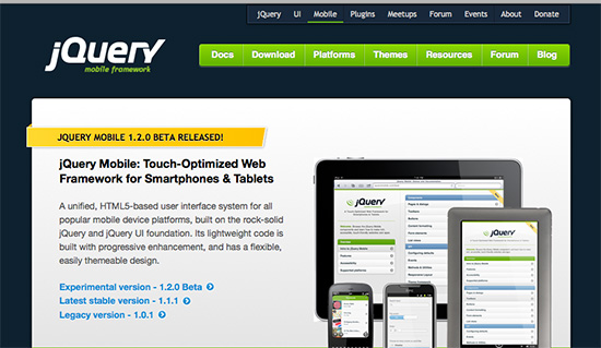
- jQuery Mobile: For developing a cross-browser compatible website, a tool developed by the trusted jQuery framework definitely works for many. A clean coding system that is supported by major mobile hardware producers gives mobile developers several advantages. Whether you want to create an interface for Android, iOS, Symbian, Windows Phone, webOS, BlackBerry or any other mobile operating system, jQuery Mobile works for all. The tool follows a simple HTML-centered layout which follows standard HTML coding including <LI> tags and built-in DIVs. You can use jQuery Mobile to develop dynamic CMS-powered websites and add themes and skin easily without worrying about resolution or screen size.
- Mobile Boilerplate: If you have used HTML5 Boilerplate or have a fair idea of how the tool works, it won’t be difficult to understand how Mobile Boilerplate works. If you want a power-packed mobile web design tool, Mobile Boilerplate can easily top the preference list. Mobile Boilerplate doesn’t create an all-in-one design that works for all mobile browsers and devices but creates separate versions for BlackBerry, Symbian and IE all at the same time. Mobile Boilerplate also supports Apache server caching and other configuration defaults.
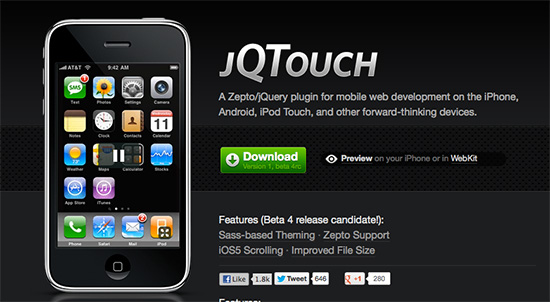
- jQTouch: An easy setup, native WebKit animations with image preloading, callback event features, flexible themes, swipe detection and much more jQTouch packs a punch and delivers every promise it makes. Built by David Kaneda and maintained by Jonathan Stark, the interactive features makes mobile web designing seem extremely easy and effortless. Try jQTouch and see how you can easily develop a site that is compatible with iPhone and Android phones.

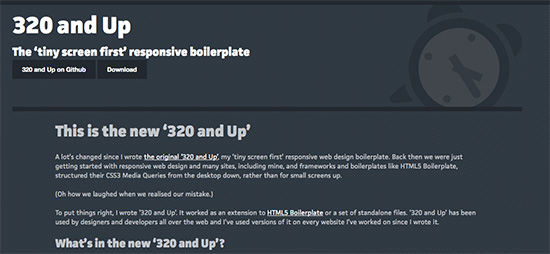
- 320 and Up: Mobile web designing is often thought to be all about skimming a full-fledged desktop version to suit the needs of a smartphone or a tablet. This is one way to approach mobile web designing. However, the other way, the way that 320 and Up suggests, is to develop websites on a small scale keeping in mind the requirements of the various hand-held devices and adding features as and when required. The features that 320 and Up currently has include Five CSS3 Media Query increments of 480, 600, 768, 992 and 1382 pixel respectively, a design atmosphere where color, texture and typography can be set, ample options for buttons, forms and tables. 320 and Up works on a HTML5 project kit and lets developers start small and go big.
- Bootstrap: If you are one who likes to trust on big names, Bootstrap comes from Twitter and maintained by Mark Otto and Jacob Thornton, surely scoring impressive points on your scorecard. Bootstrap is simple to use, flexible with HTML, CSS and JavaScript. Bootstrap is a powerful, intuitive and front-end framework that makes mobile web development faster. You can use Bootstrap absolutely free too.
- Less Framework 4: Based on the CSS grid system that makes designing a responsive and mobile friendly website easy. There are 4 layouts that you can choose from having 3 sets of typography presets that are all based on a single grid. All the layouts of Less Framework 4 are composed of 68 pixel columns with 24 pixel gutters. Since the framework is intuitive in nature, the different mobile as well as desktop browsers will take in a default layout according to its configurations.
- Foundation: The powerful CSS pre-processor that is a hallmark development from Foundation lets you customize designs and get responsive websites that easily fit into any screen size. Reducing the development time substantially, Foundation is based on a 12-column framework and also has pre-designed forms, buttons and templates.
- Treesaver: Every website has its own requirements and if you want a magazine-style layout, Treesaver will work wonderfully for you. It uses the standard HTML and CSS complaint, the websites designed with this tool makes browsing on tablets easy and reading easy and relaxed.
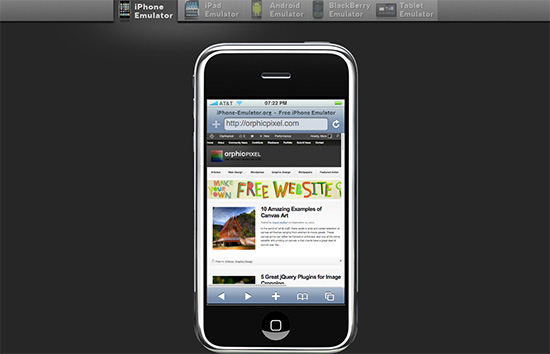
- iPhone and Android Emulators: When you are developing a mobile-friendly website, you will not be developing on a hand-held device but on the desktop. To ensure that you are making progress in the right direction, a simulator helps in several ways. A simulator imitates a mobile version, in this case for iPhone and Androids, so that you can keep checking the progress as you design. An emulator helps in the design steps but you need to finally test on real Android and iPhones to check for any real-life problems and issues.
- Zepto.js: Similar to jQuery Mobile, Zepto.js works on a compatible syntax that is easy to use and has lots of features. If you have used jQuery, using Zepto.js won’t be tough for you. The development team of this mobile website tool aims to have a large modular library that downloads fast and executes features faster using a familiar API. Zepto.js has a few default builds which are based on the Core, Ajax, Event, Form, Effects, Polyfill, and Detect modules.
Since every developer needs to hold expertise in mobile web development, it is important that understanding the above 10 and several other tools is very important. Whenever you think about web designing, you have to give ample consideration to the responsive elements of the website. You cannot be wasting your resources on designing exclusive mobile compatible and desktop compatible sites. Thus understand responsive web designing and implementing the techniques and tools of making such sites is important.
This post has been shared by PixelCrayons, a web development and mobile solutions company. You may hire professional Android developers and iPhone developers here at affordable rates.
 CoalesceIdeas Web and graphic design ideas for inspiration
